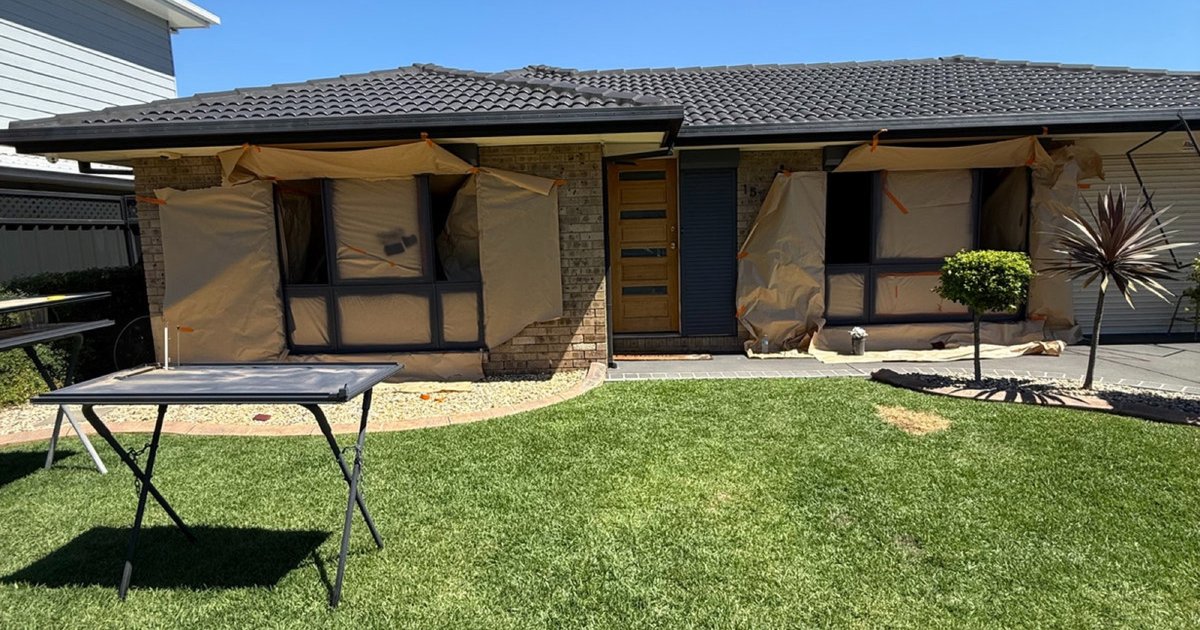
Start with the parts of the house that are staying
A window frame colour should work with the home you already have, not just a photograph you like. Compare black or charcoal, Medium Bronze, Electro Dark Bronze, Milk Cloud, Ethereal Pearl and Burnished Copper against your roof, render and brick, then approve a physical sample in the right gloss before committing.
Before choosing a frame colour, stand where you normally see the whole house. Take in the roof, gutters, walls, driveway and entry. Window frames create lines across that larger picture. A finish that looks attractive on a small card can feel much stronger when repeated around every opening.
Separate permanent finishes from things you may change. If the roof and brick are staying, make them the starting point. If new render is planned, assess the proposed render sample beside the frame sample rather than matching the frames to a wall colour that will disappear.
- Identify the roof and wall finishes that will remain.
- Decide whether frames should stand out or sit quietly within the facade.
- Include sliding doors and visible adjoining metalwork in the decision.
- Check the view from inside, where the frames sit beside floors, walls and furnishings.
Six directions to explore with real samples
Use these options as starting points, not rules about what belongs on a particular house. The same finish can look different against pale render, textured brick or shaded glazing. Actual coating samples are more useful than colour names when you are deciding between close alternatives.
| Colour direction | What to look for on your home |
|---|---|
| Black or charcoal | A defined outline around glazing; compare the strength of the contrast with the roof and walls. |
| Medium Bronze | A warmer direction; assess it beside brick, roof finishes and nearby metalwork. |
| Electro Dark Bronze | A deeper bronze direction; check how much warmth remains visible in shade. |
| Milk Cloud | A lighter direction; compare the sample with render and interior wall finishes. |
| Ethereal Pearl | Check the sample from different angles and beside surrounding materials before choosing. |
| Burnished Copper | Explore a warmer feature direction and decide how it relates to the broader facade. |
Do not choose every element separately. If your windows, sliding doors and entry surround are visible together, place their samples together as well. You may prefer one consistent finish or a deliberate feature, but the relationship should be intentional rather than the result of separate selections.
Read the roof, render and brick together
A roof can occupy a large part of the street view, so check its relationship with the frames from a distance. Matching does not necessarily mean making both identical. You might want the frames to echo the roof, or provide a softer transition between the roof and walls.
Render gives you a broad background against which a frame colour can look lighter, darker, warmer or cooler. Hold samples against the actual wall wherever possible. For brick, include both the face of the brick and the mortar in your comparison; neither should be considered in isolation.
Photographs help you remember combinations, but phone processing and screen settings can alter the impression. Use photographs to narrow your shortlist, then return to the physical samples. If two finishes seem close, compare them side by side rather than relying on memory between separate visits.
Choose the gloss as carefully as the colour
Colour and sheen work together. A different gloss level changes how reflections read across a frame and can make an otherwise similar colour appear different. Ask to see the intended colour in the proposed gloss, rather than approving the colour from one sample and imagining another surface finish.
Coastal homes deserve checks in their own setting. Bright sky, water, deep eaves and shaded balconies can all change the light around a sample. Look from the street, beside the window and from inside. Do not make the final decision from a single sunlit photograph.
A practical sample and matching process
The homepage colour studio is a useful place to explore a direction before arranging samples. Treat the preview as an aid to conversation, not a final colour standard. Screen colour cannot establish the exact appearance of a coating on your particular frames.
- Shortlist a small selection from the colours you are considering.
- Provide a physical reference if you want to match an existing finish.
- Confirm both the colour and gloss level with the coating team.
- View suitable samples against the roof, render and brick in changing light.
- Ask whether a representative test patch is appropriate for the existing frames.
- Record the approved sample, scope and finish before the full respray begins.
Be clear about what the approval covers. An exterior face, interior face and adjoining door trim may not all be included automatically. A written scope helps align the visual result with the work being quoted, and gives everyone the same reference when the coating is ready to proceed.
Include the less obvious elevations in your review. A side window under deep cover may read differently from a large street-facing opening. Walk around the home with the shortlisted samples so the final selection feels considered across the property, not just at the front door.
Common questions
Should my window frames match my roof exactly?
Not necessarily. A close relationship can make the exterior feel coordinated, but a deliberate contrast can also work. Compare both approaches using physical samples against the actual roof and walls. Judge the whole facade rather than choosing from isolated colour cards.
Can I choose a colour from the homepage colour studio?
Use the studio to explore the look and narrow your options. Final approval should use an agreed physical sample in the intended gloss, viewed at your home. The preview cannot reproduce every lighting condition, reflection or detail of the existing surface.
What should I check at a coastal home?
Check the sample in bright light and shade, with the surrounding sky and water reflections where relevant. Also have the frames assessed for salt contamination and coating deterioration. Choosing an attractive colour and specifying suitable surface preparation are both important, but different, decisions.
Can an existing finish be used as the colour reference?
Yes, an existing finish can provide a reference for the matching discussion. Identify the exact area to match and agree on colour and gloss together. Weathered areas may differ from protected areas, so select the reference deliberately rather than assuming every section still looks identical.